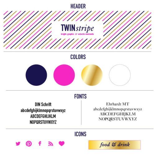
Twin Stripe has seen a few different branding iterations since its birth two years ago. The signature navy blue has always been a part of Twin Stripe, but the logo and supporting colors have been tweaked a few times. When Alison departed, I didn’t feel like the existing header fit my style, even though it worked perfectly when Alison and I blogged together. After much deliberation, I decided to make a few design changes to the blog. Whether you are rebranding or starting a new blog, here a few tips that I employ when designing a blog.
First, I recommend using Pinterest to put together a brand board. I used my brand board to gather images that inspired me and matched the Twin Stripe aesthetic. I used this board to help guide my design, but I can also reference it when styling and taking photos. Once you start this board, keep adding to it. It is a lot of fun to see how your style evolves through the years.
After putting together a brand board, I created a style sheet in Illustrator that highlights my colors, fonts and logo. I will use this when adding new elements to the Twin Stripe blog. I’m trying to figure out which blog features to keep and what should go after reading this great discussion on Elembee. I’ve been fairly minimalist, so I’m working to add more features to make the reading experience better for everyone without creating clutter. Do note that you can now receive Twin Stripe in your inbox!
When using my branding colors: navy, pink and gold, I make sure to always use the correct color values, so everything looks consistent and on-brand. I keep the hex values in a document, so I can refer to it when creating new icons or designs. When creating graphics for the blog, I only use the two type faces specified, unless there is a special reason to use a different font. It can be tempting to use a different font for each post, there are so many fun free fonts out there, but it will make your blog look jumbled and messy. (I too was guilty of using different fonts each post until I created a style guide.)
Keeping colors and fonts consistent will make your blog brand stronger and more recognizable.
Do you have any pointers for keeping your branding on track?

